15 Designer Kitchen Styling Ideas That Make Counters Look Beautiful
The empty counter changed how my kitchen looked more than any renovation ever did. Not the new backsplash. Not the upgraded faucet. Not the fresh paint or the reorganized cabinets or the better lighting.
The clearing.
Because taking almost everything off the counter, and putting back only what earned its place, did something no purchase could. Before it: every surface crowded with appliances and mail and whatever needed somewhere to go, a kitchen that looked cluttered no matter how clean it actually was. After it: two or three objects per zone, each one chosen, each one visible, a counter that reads as styled rather than merely occupied.
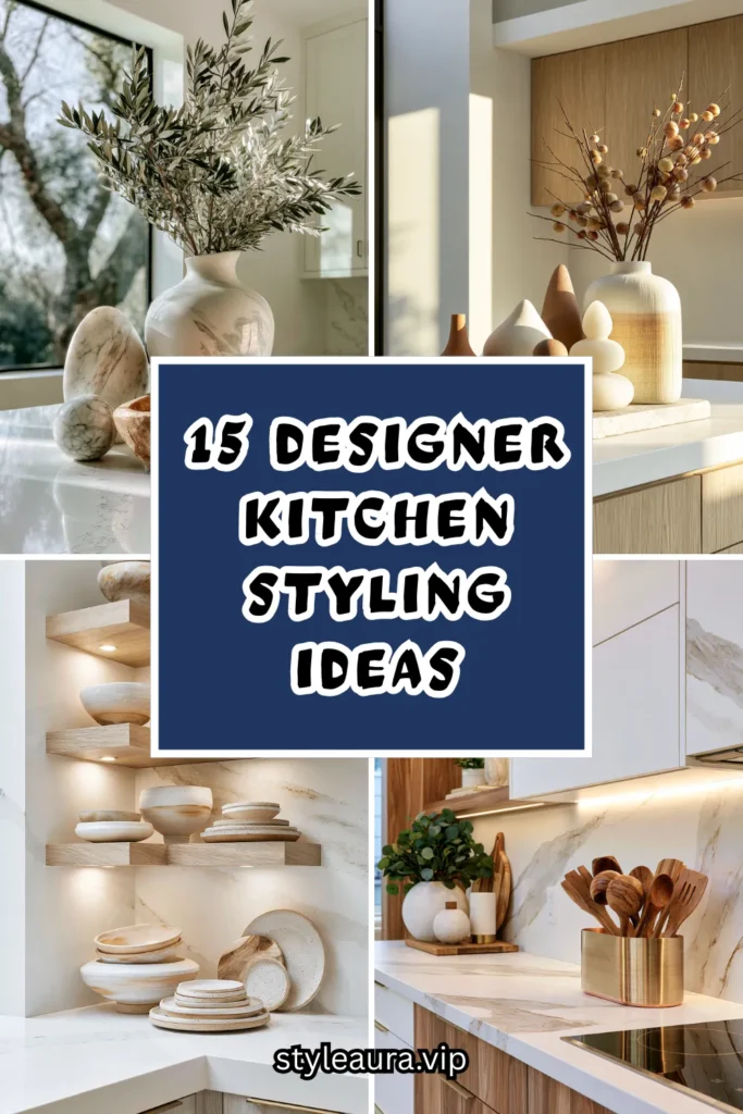
Counter styling is not about adding more. It is a curation decision. A crowded counter looks busy regardless of how nice the objects on it are. A counter with three well-chosen pieces and real negative space around them looks designed, even in an otherwise ordinary kitchen. The counter: no longer a landing zone for whatever needs a surface, but a series of small, considered compositions.
Here are 15 designer kitchen styling ideas that make counters look beautiful — from the simplest single vignette to the most fully styled kitchen — built on that understanding.
Why Counter Styling Changes the Whole Kitchen
The negative space principle
Without styling:
Every counter surface filled edge to edge with appliances, mail, and miscellaneous objects.
The eye: given nowhere to rest, everything competing for attention at once.
The kitchen: technically functional, visually exhausting.
With styling:
Deliberate empty space around every grouped object, the negative space doing as much visual work as the objects themselves.
The eye: guided to two or three specific spots, each one worth looking at.
The rule of three
Designers return to this principle repeatedly for a reason: odd numbers of objects, varied in height, read as more natural and more intentional than even, matched groupings. Three items of different heights outperform two matched items or four identical ones almost every time.
The function-first filter
Styling does not mean hiding everything useful. The best-styled counters keep genuinely used objects in view — a cutting board, a bowl of fruit — and simply choose and arrange them with more intention than an unstyled counter would.
The material conversation
A styled counter almost always mixes at least two materials — wood and ceramic, metal and glass, stone and woven fiber. A counter of entirely matching materials reads as a set; a counter of thoughtfully mixed materials reads as collected.
The Five Zones of a Styled Kitchen Counter
Before styling any single vignette:
The appliance zone
Where daily-use appliances live, chosen and arranged rather than simply plugged in wherever there was room.
The zone most people neglect, since appliances are seen as purely functional.
Worth as much visual consideration as any purely decorative area.
The prep zone
Cutting boards, knife blocks, and utensil holders, positioned for actual use.
Function and style overlap most directly here.
The easiest zone to style well, since the objects are already beautiful by design in many cases.
The display zone
A dedicated stretch of counter for a curated vignette — a bowl, a vase, a stack of cookbooks.
The zone with the most creative freedom.
Where the rule of three applies most directly.
The corner zone
Often the most awkward counter space in any kitchen, frequently left empty or crowded with clutter.
An opportunity most kitchens waste entirely.
Suited to a single tall object or a small appliance nook.
The window zone
The counter beneath or beside a kitchen window, benefiting from natural light.
Ideal for plants, a small herb garden, or a rotating seasonal display.
The zone that changes most naturally with the seasons.
1. The Three-Object Vignette
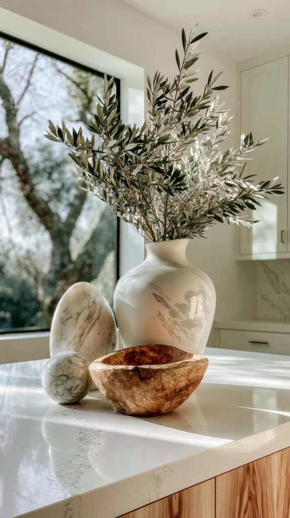
A single grouping of exactly three objects — varied in height, material, and form — placed together on an otherwise clear stretch of counter.
Why three objects is the foundational styling technique
This is the single most repeated principle in professional styling for a reason: three objects of varying height create a natural visual triangle the eye reads as balanced, whereas two objects can look sparse and four can start to look cluttered.
The height variation
One tall object, one medium, one short — a vase, a small stack of bowls, and a single piece of fruit, for example — rather than three objects of similar scale.
The material mix
At least two different materials represented — ceramic and wood, or glass and metal — avoiding a grouping where everything shares the same finish.
The spacing
Objects placed close enough to read as one grouping, with generous clear counter space surrounding the whole vignette on all sides.
The placement
A stretch of counter not used for daily prep work, so the vignette can remain undisturbed rather than being shuffled aside every time the counter is needed.
The rotation
Swapped seasonally or whenever the objects start to feel static, keeping the vignette from becoming simply another fixed, unnoticed part of the counter.
Cost breakdown: Existing objects (vase, bowl, cutting board): $0 Or new styling pieces (3): $30–90 Total: $0–90
2. The Wooden Cutting Board Lean
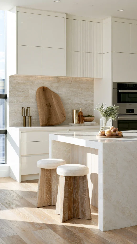
A large wooden cutting board leaned upright against the backsplash rather than stored flat in a drawer, functioning as both a styling object and genuinely accessible tool.
Why leaning a board works better than laying it flat
A cutting board laid flat on the counter takes up usable prep space and reads as clutter. Leaned upright against the backsplash, the same board becomes a piece of wall-adjacent decor while remaining immediately reachable.
The board selection
A single substantial board with visible grain, rather than a thin or heavily worn one, since this board is now on permanent display rather than hidden away.
The lean angle
Propped at a slight angle against the backsplash, stable enough not to slip, positioned where it will not block a faucet, outlet, or frequently used cabinet.
The companion objects
A small utensil crock or a stack of linen napkins placed just in front of the leaned board, extending the vignette slightly beyond the board alone.
The rotation of use
Actually used for cutting and returned to its leaning position afterward, rather than a separate board kept purely for display while a different one handles real prep work.
The size consideration
A larger board reads more intentionally as a styling object than a small one, which can look accidentally placed rather than deliberately displayed.
Cost breakdown: Large wood cutting board: $30–80 Total: $30–80
3. The Open Shelf Ceramics Display
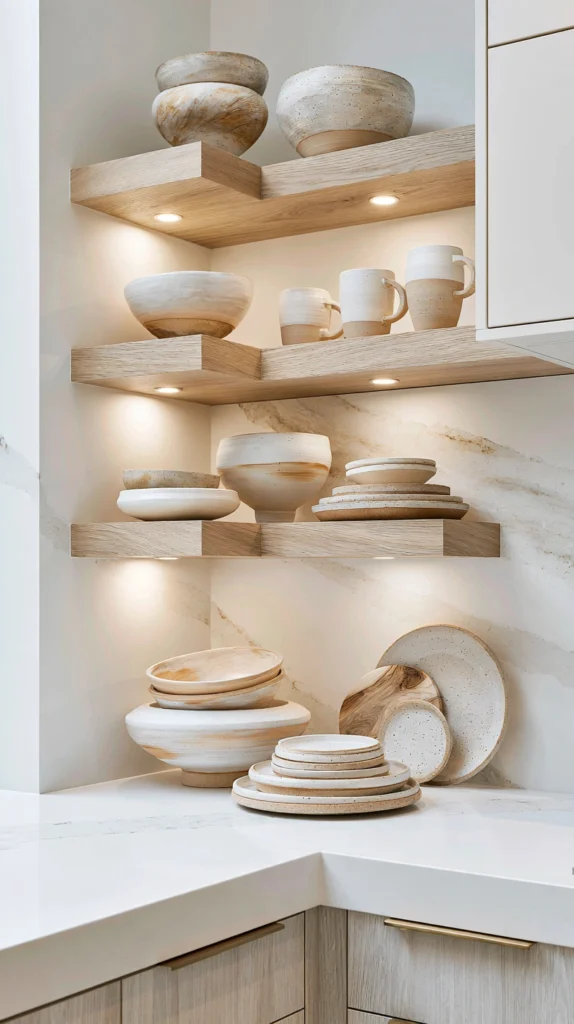
A small run of open shelving above the counter, holding a curated selection of ceramic bowls, plates, and mugs, extending the styling upward rather than confining it to the counter surface alone.
Why open shelving extends counter styling vertically
A counter alone offers a single horizontal plane to style. Adding open shelving above it introduces a second, vertical layer, doubling the opportunity for considered display without consuming any additional floor space.
The shelving
A single floating shelf or a short run of two, positioned above a stretch of counter that benefits from the added visual interest.
The ceramics
A mix of glazes and forms within a coherent color family, rather than a fully matched dinnerware set, for a collected rather than purchased-as-a-unit appearance.
The stacking
Bowls and plates stacked in varied heights rather than uniform towers, with a few pieces displayed standing on edge for visual variety.
The negative space
Roughly a third of the shelf left empty, resisting the urge to fill every available inch, since restraint is as much a part of the styling as the objects themselves.
The connection to the counter below
A single complementary object on the counter directly beneath the shelf, visually tying the two display zones together as one composition rather than two separate ones.
Cost breakdown: Floating shelf: $30–70 Ceramics (assorted, if not already owned): $40–100 Total: $70–170
4. The Fruit Bowl as Sculpture
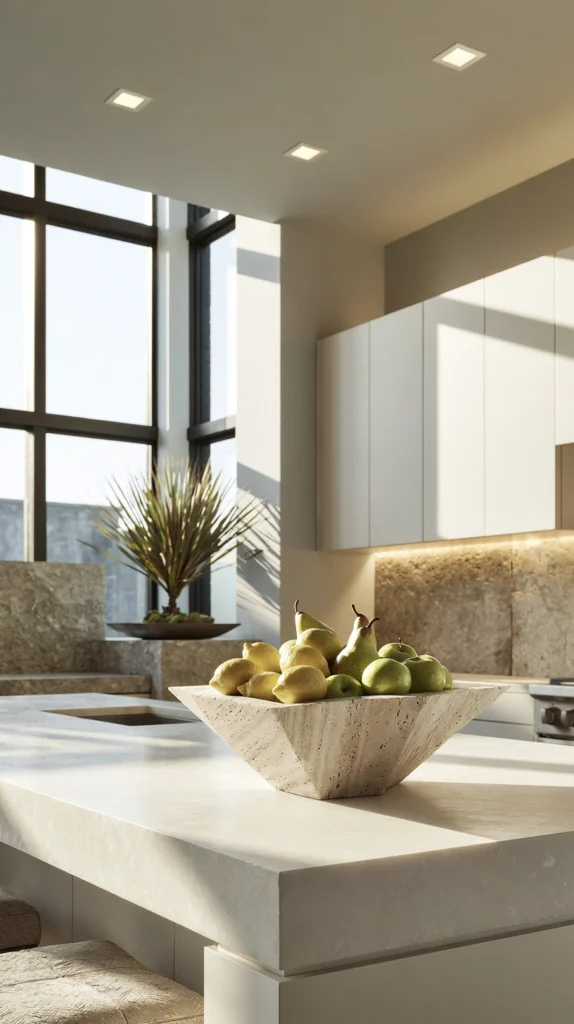
A single generously sized fruit bowl, chosen as much for its form as its function, holding fruit arranged with the same attention as any purely decorative display.
Why the fruit bowl deserves design attention
It is one of the few genuinely functional counter objects present in nearly every kitchen, making it worth treating as a design opportunity rather than a purely practical afterthought.
The bowl
A substantial ceramic, wood, or woven bowl, sized generously enough to hold a real quantity of fruit without looking sparse or overfilled.
The fruit selection
Fruit chosen partly for color variety — lemons, apples, pears — rather than only for what happens to be in the fridge, creating a more intentional-looking arrangement.
The arrangement
Larger fruit at the base, smaller or more colorful pieces layered toward the top, avoiding a flat, single-layer arrangement that reads as less full.
The placement
Positioned as the counter’s primary focal object in kitchens without a dedicated separate vignette, or as a secondary display alongside a smaller grouping elsewhere.
The turnover
Restocked regularly as fruit is eaten, keeping the display genuinely functional and fresh-looking rather than static or, worse, overripe.
Cost breakdown: Statement fruit bowl: $30–90 Fruit (ongoing): $10–20 weekly Total: $30–90 (plus ongoing fruit cost)
5. The Olive Oil and Vinegar Cruet Display
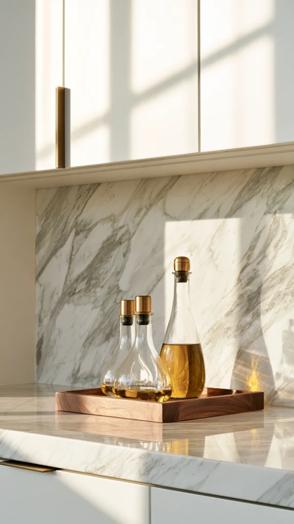
A small collection of glass or ceramic cruets holding olive oil, vinegar, and other frequently used cooking oils, displayed near the stove as both a functional station and a visual grouping.
Why cruets make an effective styling choice
Olive oil and vinegar are used daily in most kitchens, meaning this display earns its counter space through genuine function while also contributing real visual interest through color and glass form.
The cruets
Glass bottles in varied but complementary shapes, allowing the oil and vinegar’s natural color to show through rather than opaque ceramic vessels that hide it.
The tray
A small wood or metal tray beneath the cruets, containing potential drips and unifying the small collection into one grouping rather than scattered individual bottles.
The placement
Positioned near the stove for genuine cooking convenience, rather than purely decorative placement elsewhere in the kitchen.
The refilling
Decanted from larger store-bought bottles into the smaller display cruets, both for aesthetic consistency and because smaller vessels are easier to handle while cooking.
The salt and pepper addition
A small salt cellar and pepper mill added to the same tray, extending the functional-and-styled grouping slightly further.
Cost breakdown: Glass cruets (2–3): $20–50 Small tray: $10–25 Salt cellar and pepper mill: $15–35 Total: $45–110
6. The Cookbook Stack Corner
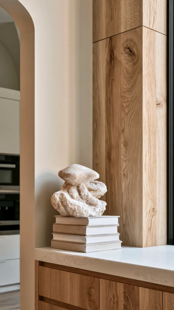
A small stack of well-loved cookbooks, styled in a corner of the counter alongside a single small object, treating the books as decor rather than storing them out of sight.
Why cookbooks work as styling objects
Cookbook spines, especially older or well-used ones, bring genuine color, texture, and a sense of the kitchen’s real history into the styling in a way most purely decorative objects cannot replicate.
The stack
Three to five cookbooks, stacked horizontally, chosen for spine color and general condition as much as content, favoring ones that are genuinely used rather than pristine, unread copies.
The topper
A single small object placed on top of the stack — a small vase, a wooden spoon rest, a smooth stone — adding height and a finishing touch to the grouping.
The corner placement
Positioned in an underused counter corner, an area many kitchens otherwise waste or allow to collect clutter.
The rotation
The top book of the stack swapped periodically for whatever is currently being cooked from, keeping the display connected to the kitchen’s actual current use.
The color coordination
Book spines chosen or arranged to loosely complement the kitchen’s existing color palette, without requiring an unrealistic amount of curation to achieve.
Cost breakdown: Cookbooks (existing or secondhand): $0–30 Small topper object: $10–25 Total: $10–55
7. The Copper and Brass Utensil Crock
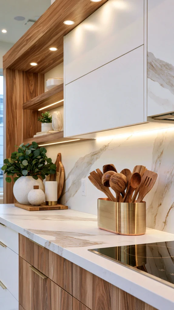
A single substantial crock, in copper, brass, or a warm ceramic tone, holding a curated selection of cooking utensils near the stove, replacing a mismatched drawer’s worth of tools left loose.
Why a curated utensil crock outperforms a full drawer on display
A crock displaying every utensil owned reads as cluttered. A crock holding only the six or seven genuinely most-used tools reads as both functional and intentional.
The crock
A copper, brass, or warm-toned ceramic vessel, chosen to complement the kitchen’s existing metal finishes.
The utensil selection
Wooden spoons, a slotted spatula, tongs, and a whisk — the handful of tools reached for daily — rather than every utensil the kitchen owns crammed into one container.
The remaining tools
Less frequently used utensils kept in a drawer, out of sight, rather than in a second overflow crock that would undermine the curated effect of the first.
The placement
Positioned within easy reach of the stove, since this display earns its counter space through genuine daily function as much as appearance.
The material relationship
Chosen to echo other metal finishes already present in the kitchen — the same copper as a pot rack, or the same brass as cabinet hardware.
Cost breakdown: Copper or brass utensil crock: $20–50 Total: $20–50
8. The Herb Pot Trio Near the Window
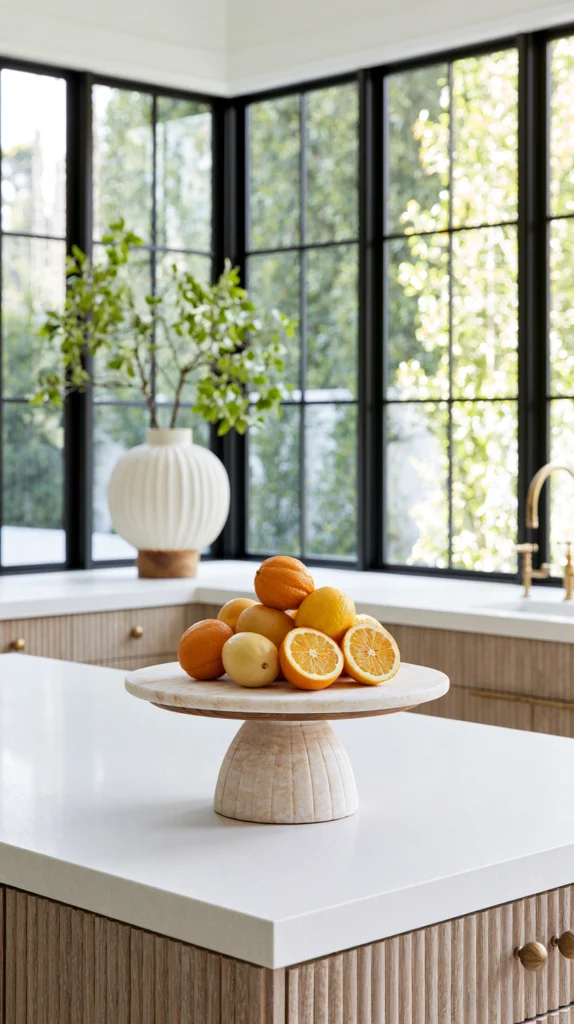
Three small potted herbs, grouped together near the kitchen window, styled with the same height-variation and material-mixing principles applied to any other counter vignette.
Why herb pots double as both function and styling
Fresh herbs serve an obvious cooking purpose, but grouped and styled deliberately — rather than scattered individually — they also become one of the kitchen’s most effective small vignettes.
The pots
Three different pot heights or styles, even while holding similar herb varieties, avoiding a uniform matched set that would read as less considered.
The herb selection
Basil, thyme, and chives, or a similar small combination suited to the specific window’s light and to the household’s actual cooking habits.
The grouping
Placed close enough together to read as one vignette rather than three separate pots scattered along the sill.
The saucers
A single larger tray beneath all three pots, rather than individual saucers, unifying the grouping and simplifying watering cleanup.
The seasonal refresh
Herbs swapped as needed through the year, while the pots themselves — the more permanent styling investment — remain constant.
Cost breakdown: Varied pots (3): $20–45 Herb starts: $15–30 Tray: $10–20 Total: $45–95
9. The Marble or Wood Cake Stand as Catch-All
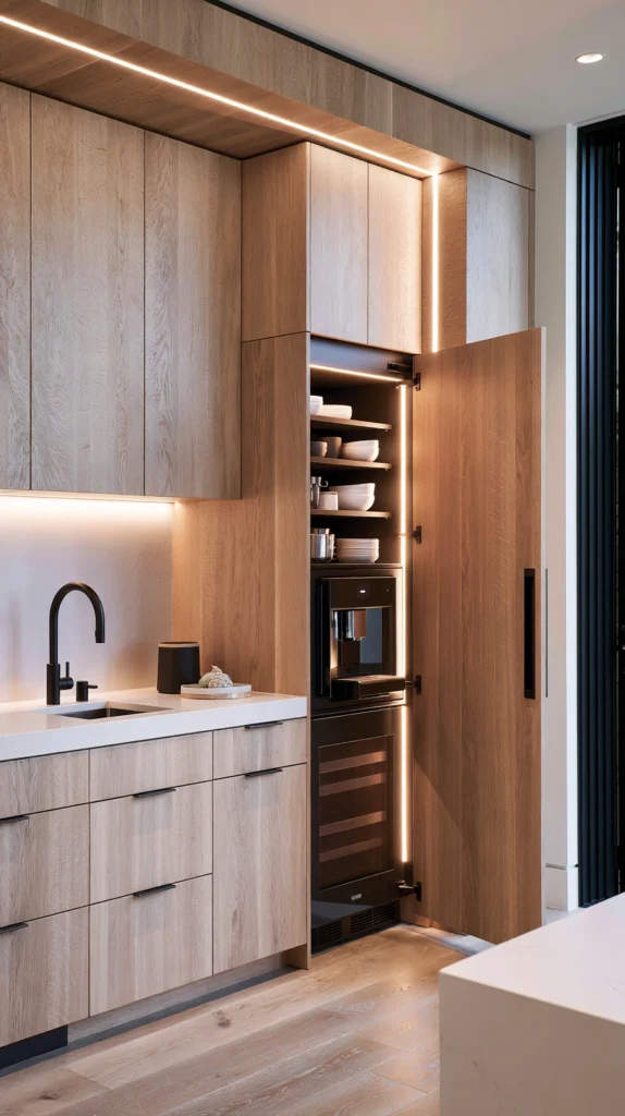
A single elevated cake stand or pedestal dish, used to hold a rotating small display — citrus, a few pastries, a candle — giving the counter a permanent point of visual height.
Why an elevated stand adds a dimension flat counter styling lacks
Most counter objects sit at the same height, on the same plane. A cake stand introduces genuine vertical variation, functioning almost like a small piece of furniture within the counter’s own landscape.
The stand
Marble, wood, or ceramic, chosen to complement the kitchen’s existing material palette, in a size proportional to the counter space available.
The rotating display
Citrus fruit for a bright, colorful look; a small stack of pastries for an occasion; a cluster of candles for evening ambiance — the stand’s contents changed regularly rather than fixed.
The placement
A prominent, visible stretch of counter, since the stand’s height makes it a natural focal point wherever it sits.
The companion pieces
Kept minimal — one or two smaller objects nearby at most — so the stand’s height is not competing with equally tall neighboring objects.
The everyday versus occasion use
A simple, restrained display for everyday use, built up more elaborately for gatherings or holidays, giving the single object genuine seasonal and situational flexibility.
Cost breakdown: Cake stand or pedestal dish: $25–70 Total: $25–70
10. The Appliance Garage Reveal
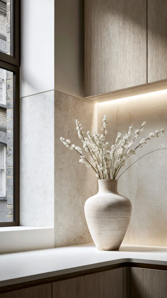
A small appliance garage — a cabinet-fronted nook housing the toaster, coffee maker, or blender — installed or repurposed to conceal daily appliances until they are actually in use, freeing the counter for styling the rest of the time.
Why hiding appliances solves the styling problem at its root
Small kitchen appliances are almost never beautiful objects in their own right, and no amount of styling elsewhere on the counter fully compensates for a toaster and coffee maker sitting in view all day.
The garage
A cabinet or nook with a tambour, bifold, or lift-up door, sized to the specific appliances it will house, either as new cabinetry or a retrofit into existing cabinet space.
The appliances housed
The toaster, coffee maker, and any other daily-use small appliance, tucked away between uses but easily rolled or slid out when needed.
The remaining counter
Freed for genuine styling — a vignette, a fruit bowl, a cutting board lean — since the appliances themselves are no longer occupying visual space.
The power access
An outlet installed inside the garage itself, so appliances can remain plugged in and functional even while the door is closed.
The daily use consideration
Worth planning for genuinely daily habits — a coffee maker used every single morning may be more practically kept accessible than fully hidden, depending on the household’s actual routine.
Cost breakdown: Appliance garage (retrofit or new cabinetry): $200–600 Outlet installation: $80–200 Total: $280–800
11. The Single Statement Object Corner
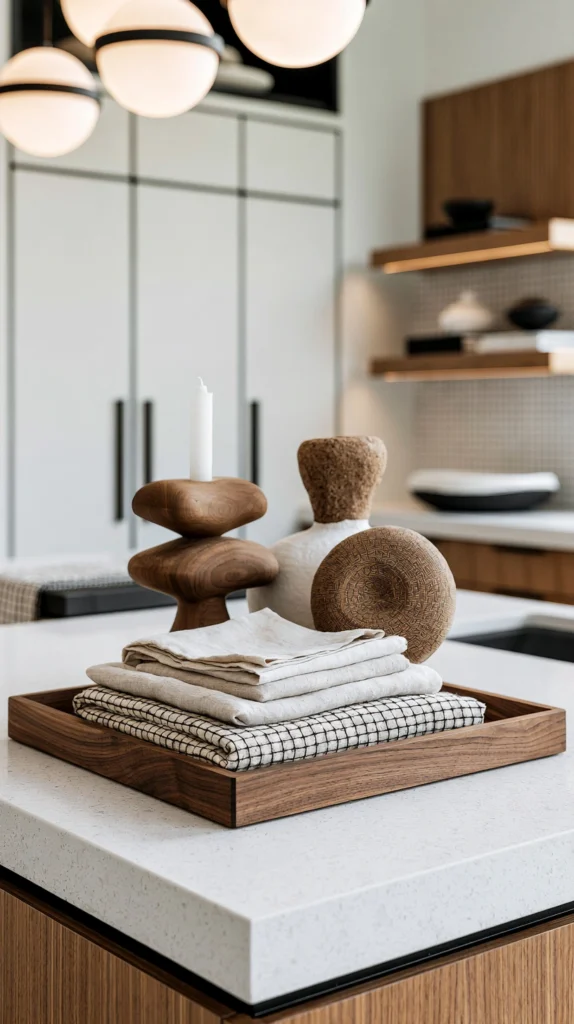
A counter corner styled around one significant, larger object — a substantial vase, a decorative bowl, a small sculpture — rather than a grouping of several smaller pieces.
Why a single large object sometimes outperforms a grouping
Not every corner needs the rule-of-three treatment. A single, well-chosen large object, given generous surrounding space, can read as more confident and more considered than a busier arrangement.
The object
A substantial ceramic vase, a large decorative bowl, or another single piece with real presence, chosen as much for scale as for color or material.
The surrounding space
Left almost entirely empty on all sides, since the object’s impact depends on the negative space around it as much as the object itself.
The corner selection
An underused counter corner, ideally one not needed for regular prep work, since this vignette depends on staying undisturbed to read correctly.
The seasonal content
If the object is a vase, filled with seasonal branches or dried botanicals; if a bowl, left empty or holding a single type of object rather than a mixed collection.
The lighting
Positioned to catch natural light from a nearby window if possible, since a single statement object benefits from good light more than a denser grouping would.
Cost breakdown: Statement vase or bowl: $40–120 Seasonal filler (branches, botanicals): $10–25 Total: $50–145
12. The Layered Tray Vignette
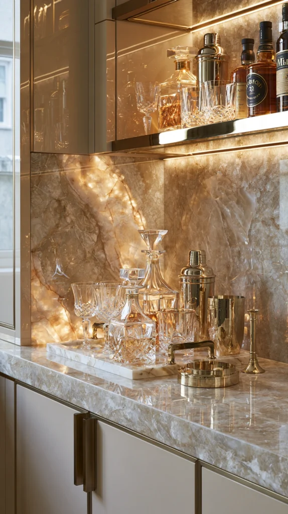
A single tray placed on the counter, holding a small curated grouping of objects together, functioning as a defined boundary for an otherwise loose vignette.
Why a tray improves an existing vignette
A tray visually contains a grouping of objects, giving it a defined edge and making the whole arrangement read as a single intentional unit rather than several separate items that happen to be near each other.
The tray
Wood, marble, or metal, chosen to complement the objects it will hold rather than compete with them.
The contents
The same three-object, varied-height principle applied within the tray’s boundary — a candle, a small stack of napkins, a single bud vase, for example.
The placement
Anywhere on the counter that benefits from a defined, contained display, particularly useful in a kitchen where objects tend to migrate and the tray helps keep the vignette visually anchored.
The practical benefit
A tray also makes the vignette easier to move entirely out of the way during active cooking, then replaced exactly as it was once the counter is needed for display again.
The seasonal refresh
Contents swapped for the season while the tray itself remains a constant, low-effort way to refresh the counter’s look repeatedly throughout the year.
Cost breakdown: Tray: $20–50 Small styling objects (3): $30–70 Total: $50–120
13. The Wine and Bar Cart Corner Alternative
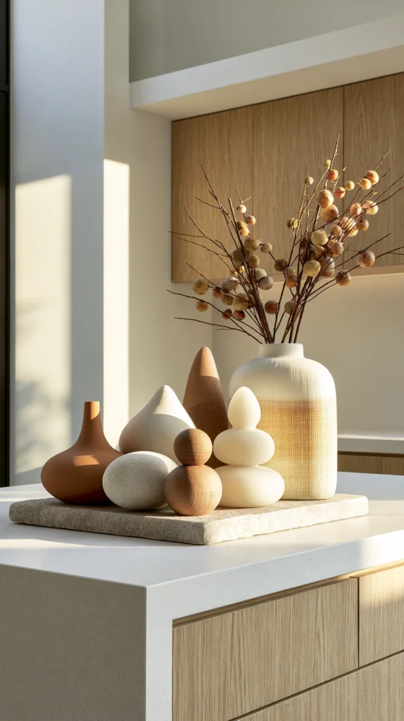
Where a full bar cart is impractical, a small styled corner of counter dedicated to a few well-chosen bottles, glasses, and a small ice bucket, functioning as a compact bar display.
Why a small bar vignette works even without a dedicated cart
Not every kitchen has room for a separate bar cart, but a modest, well-styled counter corner can capture much of the same visual effect in far less space.
The bottles
Two or three bottles with genuinely attractive labels or shapes, chosen partly for their visual appeal alongside their contents.
The glassware
A small set of two to four glasses, displayed rather than stored in a cabinet, adding both function and shape variety to the vignette.
The ice bucket or small tray
A single additional object — an ice bucket, a small tray, or a cocktail shaker — completing the grouping without overcrowding the limited counter space available.
The placement
A counter corner away from the primary cooking zone, since this vignette serves an entertaining function distinct from everyday food preparation.
The rotation
Bottles and glassware occasionally swapped to keep the small display feeling current rather than static and dusty.
Cost breakdown: Bottles (existing or new): $0–60 Glassware (4): $20–50 Small bucket or tray: $15–35 Total: $35–145
14. The Seasonal Rotating Vignette
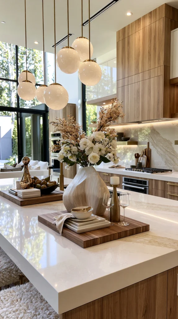
A single dedicated stretch of counter reserved specifically for a display that changes with the season — dried wheat and pumpkins in fall, greenery in winter, fresh flowers in spring — kept intentionally flexible rather than fixed.
Why a dedicated rotating spot keeps the whole kitchen feeling current
Rather than restyling the entire counter each season, isolating one small zone specifically for seasonal change lets the rest of the kitchen’s styling remain stable while still keeping the space feeling fresh throughout the year.
The zone
A consistent, clearly defined stretch of counter — the same spot used every season — so the rotation reads as an intentional practice rather than random rearranging.
The fall version
Small pumpkins, dried wheat, and a cluster of candles in warm tones.
The seasonal transitions
A brief interim period with the zone left simpler or empty between one season’s display and the next, rather than an abrupt swap, giving the eye a small reset.
The consistency thread
The same tray, vase, or base object used across all seasons, with only the contents changing, providing continuity even as the display itself transforms.
The photography consideration
For a household that documents seasonal changes, this single consistent zone offers an easy, repeatable spot to photograph across the year, showing the kitchen’s evolving character.
Cost breakdown: Base tray or vase (year-round): $20–50 Seasonal contents (per season): $15–35 Total: $20–50 (plus $15–35 per seasonal refresh)
15. The Complete Styled Kitchen Counter (The Fully Curated Kitchen)
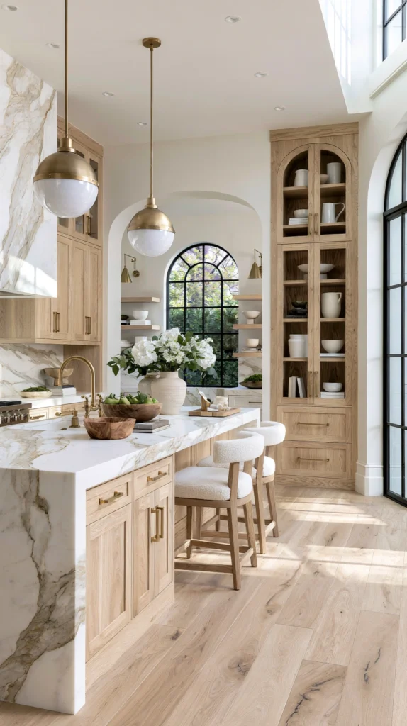
A kitchen with every counter zone deliberately considered — appliances concealed or chosen well, prep tools styled as much as stored, a display vignette, and a seasonal rotating spot — working together as one cohesive, restrained composition.
What separates the complete styling from a single nice vignette
A single styled corner: a good start. A complete styled kitchen: every zone considered with the same intention, so the whole counter reads as curated rather than one nice spot surrounded by ordinary clutter.
The elements of the complete styled kitchen counter
The appliance zone
Daily appliances concealed in a garage where possible, or chosen specifically for their appearance where concealment is not an option.
The prep zone
A leaned cutting board and a curated utensil crock, genuinely used rather than purely decorative.
The display zone
A three-object vignette or a single statement piece, given generous surrounding negative space.
The corner zone
A cookbook stack or a small bar display, filling a previously wasted or cluttered space.
The window zone
A trio of herb pots or a seasonal rotating display, taking advantage of the natural light.
The material thread
A consistent palette of two or three materials — wood, brass, ceramic — repeated across every zone, so the individually styled areas read as one cohesive kitchen rather than several disconnected vignettes.
The negative space discipline
At least a third of the total counter surface left genuinely clear at all times, regardless of how many styled zones exist elsewhere.
The complete design in action
A weekday morning:
7am: Coffee made from an appliance tucked into its garage, the counter beside it entirely clear.
7:15am: A cutting board pulled from its lean against the backsplash for breakfast prep, returned upright once finished.
7:30am: The window-side herb pots caught in morning light, the fruit bowl replenished from the week’s grocery trip.
8am: The kitchen, mid-use and lived-in, still reading as considered rather than cluttered, because every object on the counter earned its place.
The complete styled kitchen counter: not a kitchen staged for a single photograph, but a kitchen that looks the way that photograph would every single day.
Cost breakdown for the complete styling: Assuming a starting point of an unstyled but functional kitchen: Appliance garage (if pursued): $280–800 Cutting board and utensil crock: $50–130 Display vignette objects: $50–145 Cookbook or bar corner: $35–145 Herb pots or seasonal tray: $45–95 Total: $460–1,315
Phased over two or three seasons:
Season one ($100–250): The three-object vignette The leaned cutting board A general counter declutter
Season two ($150–350): The utensil crock Herb pots near the window A cookbook or corner display
Season three ($200–700): An appliance garage if the kitchen allows it A statement object or elevated cake stand A dedicated seasonal rotating zone
The styled kitchen counter: not a weekend project in its fullest form, but a restrained, considered look built with intention over time.
The Question Before Any Counter Styling
Before choosing an object, a zone, a material palette:
What is the primary reason for wanting the counters to look this way?
If the answer is: the whole kitchen feels cluttered — start with decluttering and the single three-object vignette.
If the answer is: appliances are the main visual problem — the appliance garage or a more considered appliance choice.
If the answer is: wanting one clear focal point — the single statement object corner.
If the answer is: keeping the kitchen feeling current through the year — the seasonal rotating vignette.
The design follows what is actually cluttering or under-considered in this specific kitchen, more than any single styling trend. Every idea on this list solves a different piece of that puzzle. The question is which piece matters most in this particular kitchen.
The single three-object vignette on an otherwise clear counter: still changes how the whole kitchen reads. The complete styling, done with intention: a kitchen that looks designed every single day, not only when company is coming.
That everyday polish: the whole point of counter styling.
Getting Started This Weekend
The immediate counter styling solution:
Clear one entire stretch of counter completely.
Not the whole kitchen. Not a reorganization of every drawer. One section, wiped clean of everything.
Choose three objects to put back, varied in height.
Not everything that was there before — only what earns its place back.
Lean the cutting board instead of storing it flat.
A single small change that immediately reads as more considered.
Leave the rest of that counter section empty.
The negative space is doing real work, even though it looks like nothing is happening there.
The rest of the design: the elaboration of this moment.
The clearing: the beginning. The styled counter: what gets placed back onto it with intention.