12 Maximalist Gallery Wall Ideas That Feel Curated, Not Chaotic
A maximalist gallery wall packs in more art, more pattern, and more mismatched frames than a typical minimalist arrangement, but the best versions still feel intentional rather than random. The difference usually comes down to a few underlying rules about color, spacing, and repetition that hold a busy wall together.
Below are 12 ways to build a maximalist gallery wall that reads as curated rather than cluttered, with real numbers on spacing, frame counts, and layout so the wall comes together with genuine visual cohesion.
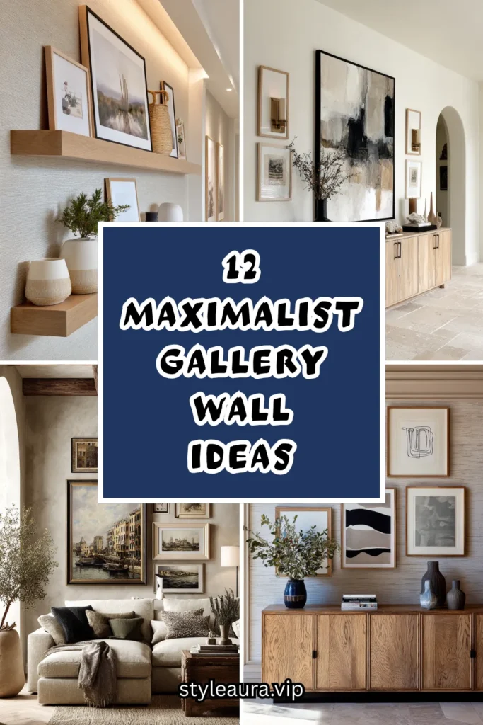
Core Principles for Curated Maximalism
What holds a busy wall together:
- A consistent thread (color, subject, or frame finish)
- Intentional spacing, even in a dense layout
- A clear focal point the eye lands on first
- Groupings within the larger whole, not one big scatter
What tips a wall into chaos:
- No repeated element anywhere in the arrangement
- Uneven, random spacing with no logic
- Every piece competing equally for attention
- Mixing too many frame styles with no common color
1. Anchor the Wall With One Large Statement Piece

Even in a densely packed maximalist arrangement, a single larger piece — at least twice the size of everything else on the wall — gives the eye a clear starting point before it moves to the smaller surrounding pieces. Standard anchor pieces run 24×36 inches or larger, positioned roughly at eye level within the overall grouping.
Budget: $150-500 for a quality large-scale print or original piece, depending on whether it’s a reproduction, a photograph, or an original artwork. This piece is worth investing slightly more in than the surrounding smaller works, since it does the most visual work in the arrangement.
Positioning the large piece slightly off-center, rather than dead center, within the overall wall layout creates a more dynamic composition than a perfectly symmetrical arrangement built entirely around a middle anchor. Every other piece on the wall should read as smaller and secondary to this one, which is what prevents even a very dense arrangement from feeling like competing visual noise.
This anchor piece is the first thing to select and hang, with everything else built and arranged around it afterward.
2. Repeat One Consistent Frame Finish
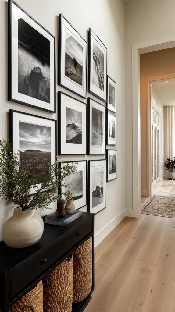
Using the same frame material or finish throughout the arrangement — all black, all natural wood, all brass — even while varying the sizes, orientations, and art styles themselves, is one of the most reliable ways to unify a busy, maximalist wall. Standard gallery walls in this style use 10-20 frames of varying sizes.
Budget: $150-400 for a full set of frames in a consistent finish, less if framing pieces gradually over time or sourcing some secondhand. Buying frames incrementally, as you add new art, is easier to manage financially than purchasing an entire matched set at once.
This single point of consistency does an enormous amount of work in a maximalist arrangement, since it gives the eye one element to recognize and rely on even as everything else (subject matter, colors, sizes) varies considerably. Mixing two frame finishes, rather than one, is manageable, but three or more tends to fragment the wall’s cohesion no matter how well-chosen the individual pieces are.
This is one of the easiest rules to apply retroactively if you already have a mismatched frame collection, since reframing pieces in a single consistent finish is often more affordable than buying new art.
3. Build the Wall Around a Limited Color Story
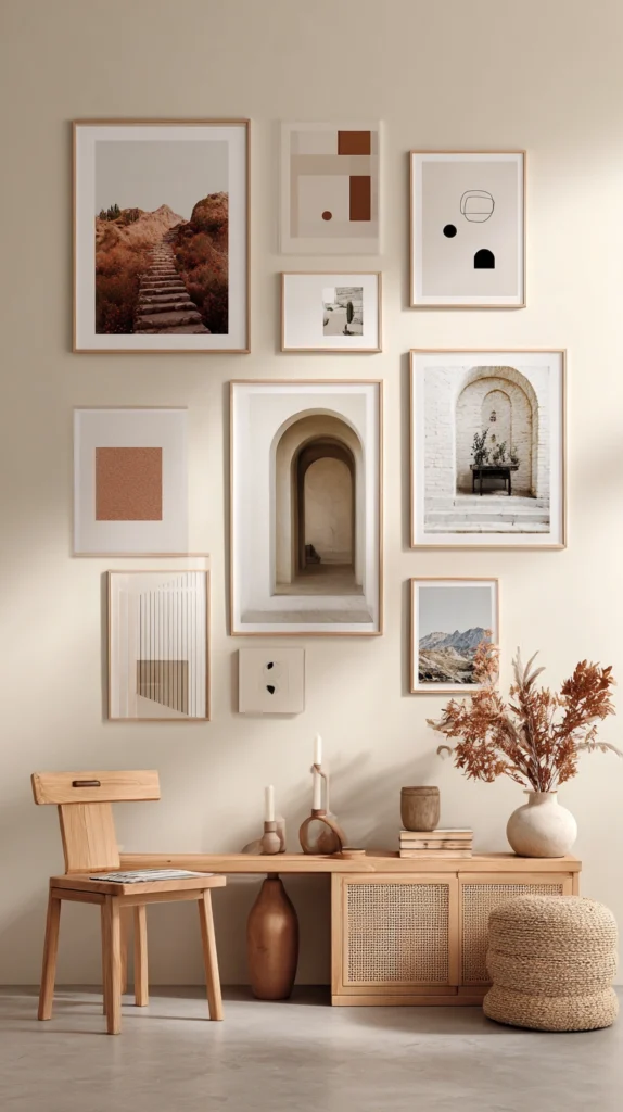
Rather than restricting subject matter, choose art and objects that share a limited color palette — three or four core tones repeated throughout the wall — even while the imagery itself varies widely between photography, illustration, and abstract pieces. This is one of the more flexible unifying threads available for a maximalist arrangement.
Budget: varies significantly depending on the art itself, since this rule applies to selection and curation rather than any specific product purchase. Building the collection over months, watching for pieces that fit the chosen palette, is more sustainable than trying to source everything at once.
A palette built around terracotta, cream, and black, for example, allows for tremendous variety in subject matter and style while still reading as intentional, since the recurring colors create a visual thread the eye can follow across the entire wall. This approach is particularly useful for anyone who already owns a mismatched collection of art and wants a unifying strategy that doesn’t require reframing or replacing existing pieces.
Photographing the wall in progress and reviewing it in black and white occasionally can help confirm whether the color balance is actually working, since color photos sometimes mask an uneven distribution that becomes obvious once color is removed.
4. Group Small Pieces Into Mini-Clusters
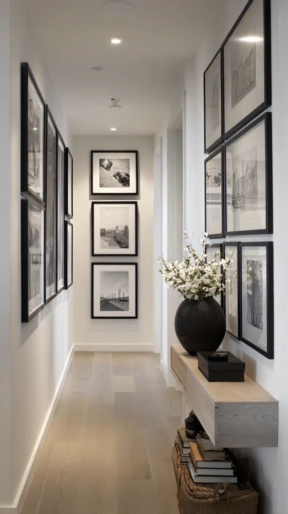
Rather than scattering many small pieces evenly across the whole wall, group them into tight 3-5 piece clusters with only an inch or two of space between each piece within the cluster, then leave more generous space between each cluster and the next. This creates a sense of organized density rather than uniform visual noise.
Budget: no additional cost beyond the art and frames themselves, since this is purely a layout strategy. Planning the cluster groupings on the floor first, before hanging anything, makes it much easier to adjust spacing without unnecessary nail holes.
This clustering technique is what separates a curated maximalist wall from one that simply has too much art spread too evenly, since tight groupings read as deliberate collections while even spacing across dozens of pieces can start to blur together into visual static. Leaving at least 6-8 inches between each cluster, even in an otherwise dense wall, preserves enough visual breathing room for the eye to process each grouping individually.
This approach also makes it easier to add new pieces later, since a new cluster can be started in an open area without needing to rebalance the entire existing arrangement.
5. Mix Frame Sizes in a Deliberate Ratio

Rather than random sizing, plan the wall using a rough ratio of large, medium, and small frames — for example, 1-2 large anchor pieces, 4-6 medium pieces, and 6-10 small pieces — which creates visual hierarchy even within a busy, maximalist arrangement. Standard sizing might run 24×36 for large, 11×14 to 16×20 for medium, and 5×7 to 8×10 for small.
Budget: this ratio applies to layout planning rather than adding extra cost, though it’s worth considering when deciding what size to frame or reprint existing pieces at. A wall with too many similarly sized pieces and no clear large anchor tends to read as more chaotic, even with fewer total pieces, than a wall following this size hierarchy.
Laying out paper templates cut to each frame’s actual size on the floor first, arranging and rearranging until the ratio and spacing feel balanced, prevents costly mistakes once frames are actually mounted with nails or hooks. This size hierarchy is one of the most important structural principles behind a maximalist wall that still reads as intentional rather than randomly assembled.
Photographing the floor layout from directly above before hanging anything gives a more accurate preview of how the wall will actually look once mounted vertically.
6. Incorporate Non-Art Objects Into the Arrangement

Small mirrors, decorative plates, textile pieces, or even a small shelf holding a plant or object break up a wall of purely flat framed art and add dimensional interest to an otherwise two-dimensional arrangement. Standard decorative plates run 8-12 inches in diameter, while small mirrors typically run 12-18 inches.
Budget: $20-80 per object depending on material and source, often sourced from thrift stores, antique shops, or home decor retailers alongside the framed art itself. Limiting non-art objects to 15-20% of the total wall composition keeps them functioning as accents rather than overwhelming the framed pieces.
A small mirror positioned within the arrangement also adds a practical function and reflects light back into the room, which can help an otherwise dense, busy wall feel less visually heavy. Mixing in one or two textural, three-dimensional elements among primarily flat framed pieces is what gives a maximalist wall genuine depth rather than reading as a flat collage.
This technique works particularly well combined with the consistent frame finish rule described earlier, since matching the object’s metal or wood tone to the frame finish maintains the wall’s overall cohesion.
7. Use a Salon-Style Layout With a Defined Border
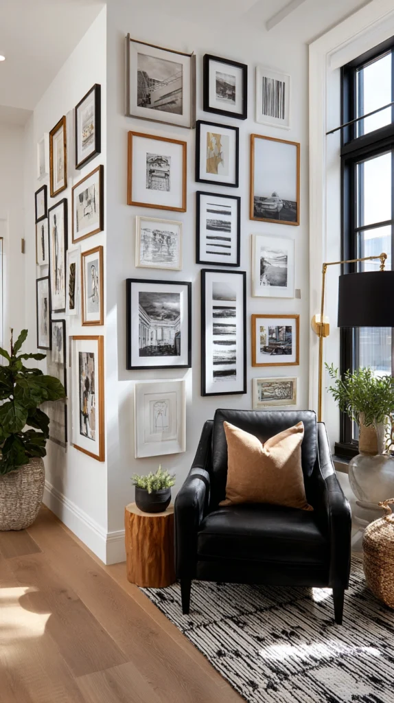
A salon-style gallery wall, where frames are arranged edge-to-edge with minimal gaps across a large, clearly defined rectangular or square area, is one of the most historically established approaches to displaying a large volume of art cohesively. Standard salon-style walls define an outer boundary, often 6×8 feet or larger, within which all pieces are contained.
Budget: this is a layout approach rather than an added cost, though it does require enough art and frames to fill a defined area without large unintentional gaps. Planning the outer boundary first, then filling inward, prevents the arrangement from sprawling unpredictably across the wall.
Keeping the spacing between frames consistent throughout the salon arrangement — typically 2-3 inches — even as the frame sizes vary considerably, is what keeps this dense style feeling organized rather than chaotic. This approach traditionally allows for significant variety in art style, subject, and even frame finish, provided the overall boundary and internal spacing remain consistent and controlled.
This is one of the more advanced layouts on this list, generally best attempted after building some experience with smaller, simpler gallery wall arrangements first.
8. Add a Recurring Motif or Subject Thread

Choosing a loose subject thread — botanical prints, black-and-white portraiture, travel photography — that appears in at least a third of the pieces on the wall gives even a highly varied maximalist arrangement a sense of connected purpose. This works alongside, rather than instead of, the color and frame consistency rules described earlier.
Budget: varies based on the specific art sourced, though building toward a subject thread over time through thrift finds, prints, and personal photography is more affordable than commissioning a fully custom themed collection. This thread doesn’t need to dominate the wall, just appear often enough to be noticeable on a second look.
A recurring subject creates a subtle “aha” moment for anyone studying the wall closely, adding a layer of intentionality that a purely random collection of pieces wouldn’t offer. This technique pairs particularly well with a personal photography collection, since travel photos, family portraits, or a specific location can serve as this connecting thread while still allowing significant variety in composition and color.
This is one of the more personal approaches on this list, since the thread itself often reflects specific interests or experiences rather than a purely aesthetic decision.
9. Balance Bold Pattern With Solid Color Breaks
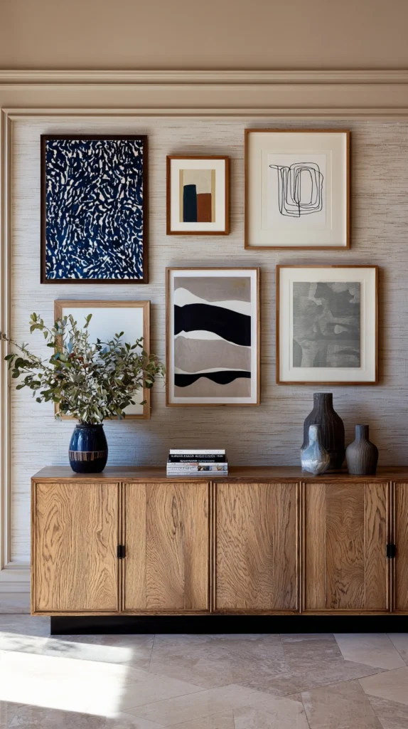
In a maximalist wall incorporating patterned textiles, wallpaper scraps, or richly patterned artwork, interspersing solid-colored or more minimal pieces between the busier ones prevents the whole arrangement from becoming visually overwhelming. Plan for roughly one calmer, solid piece for every two or three more heavily patterned ones.
Budget: no significant added cost, since this is a curation and placement strategy applied to art you’re already collecting or framing. Deliberately seeking out a few simple, solid-colored prints or objects specifically to serve as visual rest points is worth the small additional framing cost for the balance they provide.
These calmer pieces function as a kind of visual palate cleanser within a busy wall, giving the eye small moments of rest that make the more pattern-heavy pieces easier to actually appreciate individually rather than blurring together. Positioning a solid piece next to the two or three busiest, most detailed pieces on the wall is a simple way to apply this balancing technique without needing to rethink the entire layout.
This principle is especially important in genuinely maximalist arrangements, where the volume of pattern and color can otherwise become difficult for the eye to process as a whole.
10. Build the Wall in Phases Rather Than All at Once

Planning a gallery wall to be completed over several months or even years, rather than purchasing and hanging everything in a single weekend, naturally produces the collected, curated feeling that’s difficult to fake when a wall is assembled all at once from a single source. This approach applies to the process rather than any single design decision.
Budget: spread out over time rather than a single upfront cost, which also makes a large, ambitious gallery wall more financially manageable than committing to dozens of frames and prints simultaneously. Starting with the anchor piece and a small initial cluster, then adding new groupings every few months, is a practical way to build toward a fuller wall gradually.
This phased approach also allows the color story, subject thread, and frame consistency rules described elsewhere on this list to evolve naturally as you find new pieces, rather than needing to be perfectly planned out from the very first day. A wall built this way also tends to hold more personal meaning, since each addition reflects a specific moment or find rather than a single bulk purchase.
This is ultimately one of the most important underlying principles behind a maximalist wall that reads as genuinely curated rather than assembled purely for visual effect.
11. Use Picture Ledges for Flexible, Layered Display
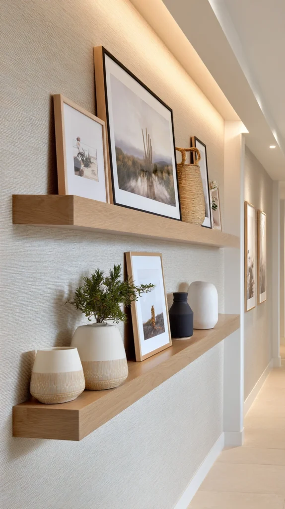
Floating picture ledges, rather than individually nailed frames, allow art to be leaned, layered, and overlapped, creating dimensional depth and making it easy to rearrange or add new pieces without additional wall damage. Standard picture ledges run 24-48 inches long and 3-4 inches deep.
Budget: $20-50 per ledge, with 2-4 ledges typically needed to cover a standard gallery wall area. This is a lower-cost, more flexible alternative to individually hanging every single frame with its own nail or hook.
Leaning larger pieces toward the back of the ledge and layering smaller ones slightly overlapping in front creates a sense of depth that a flat, evenly spaced arrangement of individually hung frames can’t replicate. This method also makes seasonal rotation significantly easier, since pieces can be swapped, added, or rearranged in minutes without any new holes in the wall.
This is a particularly good option for anyone still building their collection, since the flexible display method accommodates a growing or changing set of pieces more easily than a fully committed, permanently hung arrangement.
12. Photograph and Review the Wall Before Finalizing
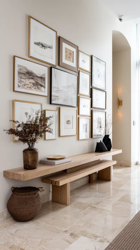
Taking a photo of the in-progress wall and reviewing it on a screen, rather than relying purely on standing in the room, often reveals spacing or balance issues that are harder to notice at close range in person. This is a simple but effective final check before committing to permanent hanging hardware.
Budget: no additional cost, since this only requires a smartphone camera and a few minutes of review time. Comparing a few different photo angles, including one straight-on and one from an angle, helps confirm the arrangement reads well from multiple typical viewing positions in the room.
Photos often reveal an uneven color distribution, an accidentally symmetrical or lopsided layout, or a cluster that reads as too dense or too sparse compared to how it felt while physically arranging the pieces. Making small adjustments based on what the photo reveals, before finalizing the hanging with nails or permanent hardware, saves significant rework and unnecessary wall damage later.
This final review step is worth doing even for a wall that already feels finished, since a fresh perspective through a photo frequently catches small imbalances that are easy to miss after spending a long time working on the arrangement in person.
Quick Start Planning List
Before hanging anything:
- Choose your anchor piece first
- Decide on one consistent unifying thread (color, frame, or subject)
- Cut paper templates and lay out the arrangement on the floor
- Photograph the floor layout from above before finalizing
Budget-Friendly Version
Lowest-cost ways to build this wall:
- Reframe existing mismatched art in one consistent frame finish
- Use picture ledges instead of individually nailing every frame
- Build the collection gradually from thrift and secondhand sources
- Print personal photography instead of purchasing all new art
Success Indicators
- The eye has a clear starting point (the anchor piece) before exploring the rest
- At least one consistent thread ties the whole wall together
- Dense areas feel intentional, not just crowded
- The wall continues to make sense as new pieces are added over time
- Guests describe it as “curated” rather than “a lot going on”
Remember
Choose one anchor piece and build the rest of the arrangement around it rather than trying to balance many equally sized pieces, commit to at least one consistent thread — frame finish, color palette, or subject matter — running through the whole wall, group smaller pieces into clusters rather than spacing everything evenly across the wall, plan the layout on the floor and review it in photos before committing to permanent hanging hardware, and build the wall gradually over time rather than trying to complete it in a single weekend for the most genuinely collected result.